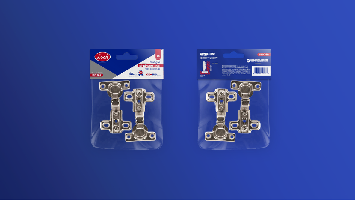
This is a very successful brand, they are the kings of padlocks and security for doors products. Since they belong to a bigger traditional brand of the region, they wanted to preserve the style of the typography, color and oval elements in the brand.
Service
Creative direction, brand identity redesign, brand book
Year
2021


Before <
> Today
The result is a brand that looks pretty much the same than its predecessor, but really feels modern and up to date. It kept the trust their customers had in the brand, kept its brand equity intact.
This type of project adds even more value to a brand that already has a brand equity and positioning, elevates its prestige with a very elegant change.

The redesign adds value keeping the Lock brand equity intact
Have a word with us and let’s analyze how your brand is performing and how much value it has, so together we can enhance its equity.


